2022年3月10日
Python 绘图库 matplotlib 介绍
摘 要
介绍 Python 绘图库 matplotlib 的基本使用方法。python
绘图1. 安装
使用 pip 安装
pip install matplotlib

# 如果你的 pip 命令不能存在可能需要使用 pip3
pip3 install matplotlib
或使用 conda 安装
conda install matplotlib
2. 绘图类型
matplotlib 支持很多种类型的图形绘制,下面介绍一些常见类型。
2.1. plot >
Axes.plot(*args, scalex=True, scaley=True, data=None, **kwargs)Plot y versus x as lines and/or markers.
plot方法绘制函数 y = f(x) 的曲线或对应标记。
import matplotlib.pyplot as plt
import numpy as np

# make data
x = np.linspace(-1, 1, 100)
y = x*x

fig, ax = plt.subplots()
ax.plot(x, y)

# show
plt.show()
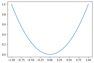
绘制其他函数只需要修改 y = x*x 即可。
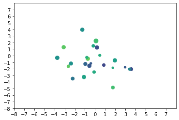
2.2. scatter >
Axes.scatter(x, y, s=None, c=None, marker=None, cmap=None, norm=None, vmin=None, vmax=None, alpha=None, linewidths=None, *, edgecolors=None, plotnonfinite=False, data=None, **kwargs)A scatter plot of y vs. x with varying marker size and/or color.
scatter方法绘制具有不同标记大小和/或颜色的 y 与 x 的散点图。
import matplotlib.pyplot as plt
import numpy as np

# make data
x = np.random.normal(0, 2, 24)
y = np.random.normal(0, 2, len(x))

sizes = np.random.uniform(15, 80, len(x))
colors = np.random.uniform(15, 80, len(x))

fig, ax = plt.subplots()

ax.scatter(x, y, s=sizes, c=colors, vmin=0, vmax=100)
ax.set(xlim=(-8, 8), xticks=np.arange(-8, 8), ylim=(-8, 8), yticks=np.arange(-8,8))

# show
plt.show()
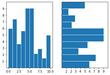
2.3. bar >
Axes.bar(x, height, width=0.8, bottom=None, *, align='center', data=None, **kwargs)Make a bar plot.
bar方法绘制柱状图。如果需要绘制水平方向的图请使用barh方法。
import matplotlib.pyplot as plt
import numpy as np

# make data
x = 0.5 + np.arange(10)
y = np.random.uniform(1, 10, len(x))

fig, (ax1, ax2) = plt.subplots(1, 2, sharey=True)

# vertical bar
ax1.bar(x, y, width=1, edgecolor="white", linewidth=1)
ax2.set(xlim=(0, 10), xticks=np.arange(1, 10), ylim=(0, 10), yticks=np.arange(1, 10))

# horizontal bar
ax2.barh(x, y, height=1, edgecolor="white", linewidth=1)
ax2.set(xlim=(0, 10), xticks=np.arange(1, 10), ylim=(0, 10), yticks=np.arange(1, 10))

# show
plt.show()
2.4. stem >
Axes.stem(*args, linefmt=None, markerfmt=None, basefmt=None, bottom=0, label=None, use_line_collection=True, orientation='vertical', data=None)Create a stem plot.
stem方法绘制茎状图。
import matplotlib.pyplot as plt
import numpy as np

# make data
x = 0.5 + np.arange(10)
y = np.random.uniform(1, 10, len(x))

fig, ax = plt.subplots()

ax.stem(x, y)
ax.set(xlim=(0, 10), xticks=np.arange(1, 10), ylim=(0, 10), yticks=np.arange(1, 10))

# show
plt.show()
2.5. step >
Axes.step(x, y, *args, where='pre', data=None, **kwargs)Create a step plot.
step方法绘制跳跃图。
import matplotlib.pyplot as plt
import numpy as np

# make data
x = 0.5 + np.arange(10)
y = np.random.uniform(1, 10, len(x))

fig, ax = plt.subplots()

ax.step(x, y)
ax.set(xlim=(0, 10), xticks=np.arange(1, 10), ylim=(0, 10), yticks=np.arange(1, 10))

# show
plt.show()
2.6. fill_between >
Axes.fill_between(x, y1, y2=0, where=None, interpolate=False, step=None, *, data=None, **kwargs)Fill the area between two horizontal curves.
fill_between方法填充两条曲线水平方向之间的区域
import matplotlib.pyplot as plt
import numpy as np

# make data
x = np.linspace(0, 10, 10)
y1 = np.sin(x) + 2
y2 = y1 + 4 + np.random.normal(0, 0.5, len(x))

fig, ax = plt.subplots()

ax.fill_between(x, y1, y2, alpha=0.3, linewidth=0)
ax.plot(x, (y1 + y2) / 2, linewidth=3)
ax.set(xlim=(0, 10), xticks=np.arange(1, 10), ylim=(0, 10), yticks=np.arange(1, 10))

# show
plt.show()
2.7. imshow >
Axes.imshow(X, cmap=None, norm=None, *, aspect=None, interpolation=None, alpha=None, vmin=None, vmax=None, origin=None, extent=None, interpolation_stage=None, filternorm=True, filterrad=4.0, resample=None, url=None, data=None, **kwargs)Display data as an image.
imshow方法将数据作为图片输出。
import matplotlib.pyplot as plt
import numpy as np

# make data
X, Y = np.meshgrid(np.linspace(-5, 5, 32), np.linspace(-5, 5, 32))
Z = X**2 + Y**2 + X + Y

fig, ax = plt.subplots()
ax.imshow(Z)

# show
plt.show()
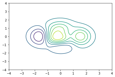
2.8. contour >
Axes.contour(*args, data=None, **kwargs)Plot contour lines.
contour方法绘制轮廓线。
import matplotlib.pyplot as plt
import numpy as np

# make data
X, Y = np.meshgrid(np.linspace(-4, 4, 256), np.linspace(-4, 4, 256))
Z = (1 - X/2 + X**5 + Y**3) * np.exp(-X**2 - Y**2)
levels = np.linspace(np.min(Z), np.max(Z), 10)

fig, ax = plt.subplots()
ax.contour(X, Y, Z, levels=levels)
# contourf 方法将采用填充方式绘制轮廓线

# show
plt.show()
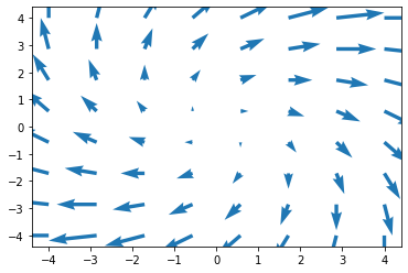
2.9. quiver >
Axes.quiver(*args, data=None, **kwargs)Plot a 2D field of arrows.
quiver方法使用箭头绘制平面场。
import matplotlib.pyplot as plt
import numpy as np

# make data
X, Y = np.meshgrid(np.linspace(-4, 4, 8), np.linspace(-4, 4, 8))
U = X + Y
V = Y - X

fig, ax = plt.subplots()
ax.quiver(X, Y, U, V, color="C0", angles="xy", scale_units="xy", scale=6, width=0.01)

# show
plt.show()
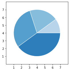
2.10. pie >
Axes.pie(x, explode=None, labels=None, colors=None, autopct=None, pctdistance=0.6, shadow=False, labeldistance=1.1, startangle=0, radius=1, counterclock=True, wedgeprops=None, textprops=None, center=(0, 0), frame=False, rotatelabels=False, *, normalize=True, data=None)Plot a pie chart.
pie方法绘制饼图。
import matplotlib.pyplot as plt
import numpy as np

# make data
x = [1, 2, 3, 4]
colors = plt.get_cmap('Blues')(np.linspace(0.3, 0.7, len(x)))

# plot
fig, ax = plt.subplots()
ax.pie(x, colors=colors, radius=3, center=(4, 4),
       wedgeprops={"linewidth": 1, "edgecolor": "white"}, frame=True)

ax.set(xlim=(0, 8), xticks=np.arange(1, 8),
       ylim=(0, 8), yticks=np.arange(1, 8))

plt.show()